Tangible Actions/Replaying Gestures (MSc. Thesis Work)
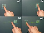
June 2009 - April 2010Once the novelty effect wears off for a direct multitouch interface, interaction can be very slow and inefficient compared to the high-gain mouse interactions most users are familiar with. We developed the concept of Tangible Actions based on the broad idea of making the user’s previous actions tangible and manipulable. Tangible Actions are continually-created interactive in-situ representations of the user’s interface actions that can be modified and re-used at a lower interaction cost than re-performing the original interactions. We have implemented Replaying Gestures on the Microsoft Surface platform, an attempt to make direct multitouch interaction more efficient by allowing the user to record, modify and replay their previous actions. VIDEO AND WRITE-UP COMING SOON-Sept. 2010.
Fingerpainting on the Microsoft Surface (with Julian Lepinski)
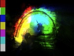
January - April 2010For a course on sketching interfaces with Prof. Karan Singh, a colleague and I wanted to explore how to use the rich input available with the Microsoft Surface (grayscale bitmap input) as a suitable artistic tool. For our specific project, we were inspired by painters that use a wide variety of colour overlaid on a base image. We thought it would be cool to use a fine base image that was already made, and "play" with colour on top of it. This is suitable as the Microsoft Surface is not great at fine input. We made a functional prototype where users could lay down paint and move it around by applying inertia.
Scribbling with Typeset
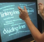
September 2009 - February 2010Typeset text via keyboard text input is still mostly confined to rigid, linear textboxes, while freeform written text from a stylus or pen and paper is slower and harder to read and re-use in new contexts. I created a prototype on the Microsoft Surface that combined the best properties of both of these worlds: quick, searchable and readable input with expressive layout. I was heavily inspired by my own paper notes. As of September 2010, I am studying notes people make during creative work to motivate design of further prototypes. Video URL: http://www.youtube.com/watch?v=mAz6HmtNEds. I was interviewed about this project on CBC Radio's Spark. Listen here.
Above The Surface Interaction
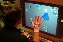
May - December 2009A project on mixing on-interface and above-interface interaction, using a Microsoft Surface and a vicon motion capture system. For a full description (with video), see my blog entry.
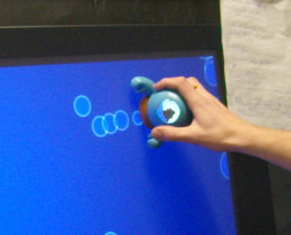
Tangible Surface Monster and Bubbles
December 2009When Microsoft Surface demonstrated a Surface Monster tangible, I begged them to send me one to play with the interaction style. This was a whimsical project that received some notice at CHI 2009 as a novel way to extend the interface space of the tabletop into the space above it. For a full description (with video!), see my blog entry.
Slampad (with Julian Lepinski)
September - October 2009A colleague and I submitted an entry to the UIST 2009 Student competition sponsored by Microsoft, which challenged entrants to come up with a use for a keyboard that could detect the pressure applied to each key. Here is the pitch from our entry: Mental distractions during text-entry tasks requiring intense concentration are harmful. However, a mental distraction may be so important that it must be written down. Switching windows or opening another application is disorienting, and distracts from the primary task. SLAMPAD leverages the sensitivity of the Microsoft pressure-sensitive keyboard so that a harder keystroke allows the user to switch to the SLAMPAD overlay and continue entering text immediately. Another hard keystroke exits the mode, and returns the user to the visual context of the primary task. SLAMPAD represents an area for rough notes that can be referred to as needed.
Evolving Ambiguous Digits
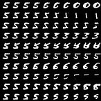
November/December 2008I wanted to bring a Human-Computer Interaction slant to my Machine Learning class project. I was interested in using the "wisdom" held in a neural network to provide suitable feedback to users. When classifying handwritten digits, it can sometimes be very unclear why a certain digit was not recognized as expected. Since the recognition feedback is binary (pass/fail) the user is forced to use trial and error to determine the ideal way to draw a digit. One could look at a "standard" digit and attempt to mimic it, but this does not let users relax into their own handwriting style.
I trained a neural network (a multi-layer Restricted Boltzmann Machine) on a large set of handwritten digits. I then developed a method to evolve a given user input towards a given class. For example, I could take a given '5' and make it look more like a '5'. Or, if I meant to draw a '5' and it was recognized as a '3' I could evolve it towards a '5' to see what changes I needed to make to the style I used for my 5's so that they would be recognized as expected. For fun, you could also evolve any input towards any other class, with some interesting results. See my blog entry for another description: http://dustinfreeman.org/blog/?p=185
Devices that Bruise (with Alicia Grubb)
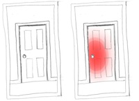
November/December 2008For a Topics in Ubiquitous Computing class, a colleague and I were interested in helping people get out of being in a bad mood. Typically when someone is in a bad mood, it does not improve the situation to directly tell them. Instead, subtle feedback may be better. We created the concept of alerting people they were in a bad mood by using an ambient display. "Bad mood" could be detected in a few ways, such as volume (raised voice) or accelerometers (banging things or treating them roughly). We suggested objects that detected they were being treated badly could glow red, like raw skin. This also has the side benefit of the objects informing users subtly when they are being used incorrectly.
Mimicry-Afforded Gesture Instruction
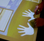
October 2008I was exploring techniques to teach novel gesture interaction "in the moment". The alternative is to have the user learn everything interaction up front, or to have a large toolbar that takes up screen real estate. I created a concept video that showed me working on a multi-touch tabletop I was using "for the first time". The table was non-interactive, so its behaviour was pre-recorded, and I was "playing the mime". Instruction is afforded with animated hands for the user to mimc. For every interaction context, the most likely interactions were acted out to the user with an animated hand. If the user was touching the interface with no effect, the interface would suggest what it thought the user might be trying to do, and how to do it with another animated hand. This concept was shown to a few people and inspired later work. See the video: http://www.youtube.com/watch?v=K5wYGMdcPFs
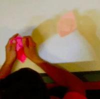
Teaching Origami by Overlaid Video
October 2008The motivation of this project was to teach novel gestural interaction to new users when static diagrams did not suffice. I recorded a video of myself making an origami boat. Then, I projected this video full-size back onto the same space. I brought in a few people to try to learn the process. The video was project both offset and coincident to the participant's hands. I also played with making the video temporally "jagged" so it ran back and forward over important points. I observed that people easily became lost in the video, which led me to believe that time-based media is not the best way to teach difficult manual activities. See the video: http://www.youtube.com/watch?v=y56dNNNTp-4