
This is an install in a 3 x 8 metre room with stereoscopic projection (a Hive) in the Communitech Hub in Kitchener, sponsored by Christie Digital and CAFKA. The project was started by Ruth Gibson and Bruno Martelli (aka Igloo). There is more about the conception and themes of the project on their page. This doc is a description of the interface and behaviour used to fly the airship around the abstract landscape. I (Dustin) worked on the programming and collaborated on some of the physical interface design.
General Info and Visiting Instructions
We have a high-resolution scan of Svalbard, an island far north of Norway. The island is very secretive – it is suspected there are a few military bases nearby – and if you look at the satellite view in Google Maps, the resolution of the data is very low. While you can fly around most other places in the world at high-resolution using Google Maps, Svalbard is separate, still mysterious and far away. Also, if you want to leave a city in Svalbard to wander around the island, you are legally required to carry a gun to defend against polar bears. In a world that’s generally well-mapped and understood, Svalbard stands apart.
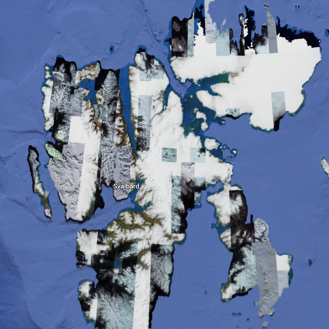
We represent the island as a wireframe. This visualization originated to give us a sense of the resolution of the data, but when we noticed the size of the polygons changed drastically depending on detail of the landscape, the aesthetics of it were quite nice. While it looks somewhat retro, Tron-ish, that is not exactly the feeling we are aiming for. It is hard to aesthetically explain the feel of this without experiencing the landscape in the Hive. A hill made of raw polygons somehow draws one in much more than a hill that is filled in and shaded. It is very unusual for polygons to be regularly arranged, and you are drawn towards small-polygon, high-detail areas. Whatever algorithm was used to simplify them from the source data creates a Jackson Pollock-like arrangement of triangles that is visually enticing.
Personally, I’ve always been drawn to representations of cold, north, mysterious places. Out of the whole Group of Seven, I have always been drawn most to Lawren Harris, who entices me with his simplified, iconic representations of north. Somehow, an iconic form of the landscape feels more true and effective than one that is literally photographic.

The Status Quo of Navigation
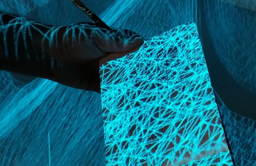
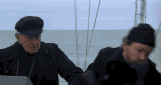
In the commercial space where our Hive is set up, it is mostly used as a tech demo to tour groups, and rented by architects to visualize building plans for clients. The space is large enough to walk around a digital car. The current tool to navigate across 3D space is a smooth-future-plastic-molded object with a trigger and a joystick, called a view tracker. The curved plastic sections hold retroreflective markers visible to the 3D motion tracker cameras set above the Hive.
![]()
A forward push on the joystick of the view tracker lurches us forwards in the direction it is pointing. While the velocity is proportional to the push on the joystick, the acceleration is instant, which makes navigation a disorienting stop-and-start affair, similar to Flight Simulator’s slew mode.
The nature of this navigation doesn’t lend itself to the slow, meandering navigation we wanted to achieve with our piece.
The Feel of North and Exploration
I don’t want to put words in Bruno and Ruth’s mouths, but I’ll summarize what I got out of them from conversation, and their previous work in virtual spaces. Much of their work looks like video games, but they are very careful to avoid making things gamey. Explicit visual goals should be avoided, as should a sense of progression. Anything of the sort puts exhibition attendees, whether or not they have video game experience, in the mindset of trying to figure out what the world is wanting them to do. They don’t like their work being compared to Dear Esther (which explores an island in the Hebrides), or to Tale of Tales’ body of work (http://www.tale-of-tales.com/videogames.php). Both of these tend to fudge the definition of “game” – which, if you believe Salen and Zimmerman, require a “quantifiable outcome”. Dear Esther isn’t “hard” in the game sense – the player (experiencer?) just meanders about an island discovering sound bites. However, these weave together into a primarily-linear story, and yield a sense of finish in the end. Bruno and Ruth want to avoid the sense of progression altogether in their virtual environments; more wandering, perhaps, than exploration. I remember one moment, in the middle of playing Dear Esther, where I was unsure where to go next because I had not discovered any more sound bites, and ended up switching from a meandering state to more frantic running around the edge of the thus-far explored map.
(see Glenn Gould’s “The Idea of North” chapter in his Solitude Trilogy))
What does this mean for the sense we want to make of exploring Svalbard? The north, or any sort of lonely exploration, is cold, hard and effortful. The immediate slew mode given by the view tracker felt just wrong. The amount of detail we have in our scenery is enough that you can leave the Hive in any one position on the map, and spend minutes looking around. It is unclear if this is because of the (literally physical) immersion of the Hive, the island model, or the natural curiosity of the occupants (us). The high speed given by the view tracker is almost boring. I recall games that use fast travel as a mechanic you must depend on, and I always try to avoid it when playing them initially, but end up begrudgingly giving in as points of interest are so far apart. I also recall how Jon Blow describes trying to make the level design in The Witness feel exploration-y in the sense that the most interesting stuff in any location is almost immediately in front of you, and that you don’t get a sense that you are ever in a between, filler place.
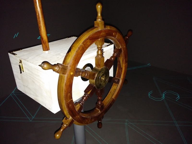
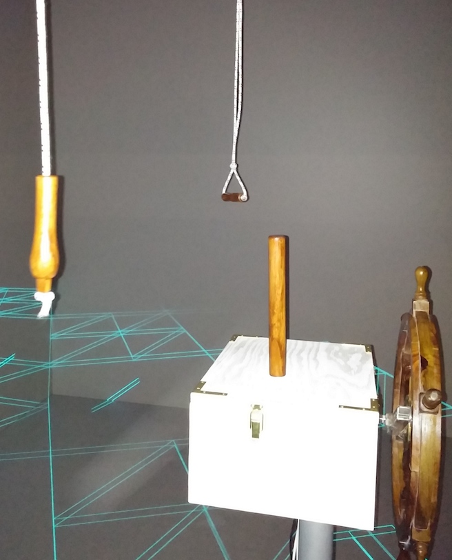
Our fundamental idea for navigating the space emerged as a floating airship. Many of the initial explorations over the northern polar regions were by airship, and they often departed from Svalbard, so this worked thematically. Additionally, Bruno and Ruth found a really nice wooden wheel in a nearby shop that we wanted to put to use. Thus began the interesting design problem of taking the dinky, finger-movement navigation that currently is used in the Hive and turning it into something that felt more like it should feel.
A for Effort
There’s an optimization in Human-Computer Interaction to accomplish more with less effort. Get through more list (accurately, of course) with less physical and mental exertion. However, as I’ve said above a couple times, that just didn’t feel right in our case, and we sought to make an interface that did. We needed to control:
– Turning left and right (the wheel, obviously)
– Going up and down (floaty, like a blimp, as opposed to like a plane)
– Speed (Not too important, but people should be allowed to stop at points of interest)
With video games, you want to have a high degree of control. You go fast, turn fast, generally do things that would make you throw up in real life. Our goal is to produce slow, contemplative, meandering motion. The controls could not be too responsive as, in the Hive, that can lead to motion sickness, and fast controls imply that the controller has somewhere to go. Managing the controls themselves and observing the landscape as it is passing by should be its own delight.
It was hard to come up with a setup for the steering wheel that required the right amount of effort to turn, yet still turned smoothly. In the meantime, I implemented WASD-style controls for the airship, AD for left and right, WS for elevation, Shift to go faster and Control to brake to zero speed. I set it up so that if no speed controls were pressed, then the speed of the airship would slowly tend towards an “idle” speed, like a car with automatic transmission. This turned out to be really nice and it made it so that when exhibitors would first come across the exhibit, the ship would flying slowly, and the interest of the scene was high enough that it could be watched for several minutes. Having a non-zero starting speed also satisfied some of Bruno and Ruth’s goals in the sense of wandering. If the airship starts with zero speed, it requires user interaction to start things going, and one cannot interact without an intention. This is the odd problem of deciding where to go once you get in a car or on a bike. Frustratingly, unless you live in the middle of a flat desert, you need to think about where you’re going to go before you start going there. This thinking is usually tedious and not very fun. Having a passively-moving ship you can gradually seize control of is much more interesting.
With our basic WASD controls set up, I prototyped some of the feel of the airship’s flight while others hunted down hardware for the physical controls. The first device we got was a Logitech racing wheel, including two levers right behind the wheel, and a gas/brake pedal. The wheel had a nice torque feedback where it pulled back to centre, but its look and feel was far too much like a racing car. We also found a joystick, which we felt would work well for controlling climb and descent. The racing wheel came with gas pedals, but we felt it would be uncomfortable to use these while standing. Putting a chair in there would encourage visitors to stay longer, which you don’t want in a gallery.
Gas and Brake by Exertion
We had an interaction by turning something (the wheel, changing heading), and an interaction by a control column (the joystick, changing elevation) and I really wanted to find something of a different character for speeding up and slowing down. Ideally, speeding up and slowing down would feel different from each other, but I would be happy with anything that was different from the other existing controls. We were excited about using an engine telegraph to control throttle, but it would cost $800+ to buy a real one that was large enough, and making one and running the cables to a separate object would be too much work.
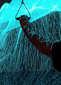
I became really infatuated with a linear pulling motion, the kind that feels like you’re pulling on an emergency drag chute, or, opening a valve that lets a torrent of rocket fuel into your engine. I thought of finding a screen door piston (a novelty to the British), and we looked at a few, but found they required too much force. During a trip to Toronto’s Active Surplus, I came across a whole bin of paint-spraying tools, which provided both damping and a pulling-back spring. These would be perfect.
While it would be nice to have a linear measure of how far these tools were pulled, we opted for a set-up where a rubber band would pull on a binary switch mounted on the top. Using a rubber band, instead of a less stretchy rope, ensures we can travel over the entire length of the tool’s extension without breaking the switch.
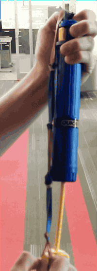
These tools were mounted from the ceiling, and we hung down a length of nautical-looking wire. To visually and physically differentiate gas and brake, we used different knots, and stained wooden knobs stolen from different tools. I like how the brake pull cord looks and feels a little bit more like an “emergency” option because it is easier to grab onto and yank on.
The tension required to pull these down felt quite perfect – you can hold onto them and rest the whole weight of your arm without actuating them – it requires sustained effort to gas or brake.
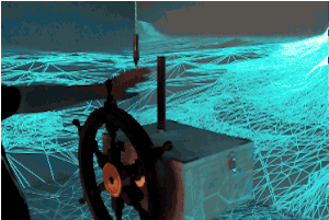
The Wheel and The Stick
For the wheel, we used a large AC motor to provide resistance and a solid shaft to spin around. If you give it a good spin, it rotates a few times before slowing to a stop, like on Wheel of Fortune. We got a local carpenter to build a solid wooden box that the motor sits in, which sits on top of a very sturdy metal stand that we cannibalized from a table.
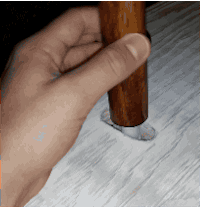
For the stick, we disassembled a joystick and inset it in the wooden box so the stick came through a slot, restricting its movement to only forwards and backwards. We removed the molded curvy plastic shaft and drilled into a wooden dowel to create a longer shaft, and shoved it on the end of the stick. This creates a nice, heavy feel to moving the stick. Unfortunately, the stick doesn’t have much damping when it returns to zero, so it bounces slightly.
To get rotation signals from the wheel, we had Michael Yan set up an Arduino Leonardo with a rotation encoder. To keep it simple, when the Arduino was plugged in a USB port, it acts like a mouse (after a hiccup where Windows XP tries to identify it every time), and we send mousewheel events when the wheel turns. The stick was already a USB joystick, so we just had to plug it in. To get the signals from the gas and brake switches, we ran wires across the ceiling girders, down the wall and across the floor, soldering them to buttons on the joystick circuit board. This hack works nicely as we don’t need to build any more circuitry (on an Arduino) and we can test the gas and brake behaviour by pressing the built-in buttons on the circuit board.
Overall, the final set-up is quite nice. I wish we had come up with something a little cooler for the joystick, like something at hip level on either side, but we ran out of time and didn’t want an extra thing on the floor that people would trip over and would be have to be moved each day by the gallery manager.
Feedback of Gradual Changes
I’m going to talk about interface and motion design of the blimp since I’ve described the entire physical interface. Realistically, the motion design and physical interface were being designed side-by-side throughout the process.
Turning, climbing and descending, and acceleration and braking are all very slow. Being in a gallery space, and without giving any clear goals, our interface needs to be walk-up-and-use, and this runs counter to an interface that responds slowly. I conceptualized the motion design as having a gradual outcome, but requiring immediate feedback. The immediate feedback needs to be designed so that what the gradual outcome will be is obviously hinted.
For climbing and descending, we pitched the ship up or down.
For gas or brake, we thought of doing camera shake or sound effects, but could not come up with something in time.
For turning, we rolled the ship – except this was harder to figure this out, and I’ll explain it in the next section.
These are fairly obvious and align with people’s intuition towards airplane movement. For the stick and the pull knobs, these control a rate of change of a variable. The immediate feedback is of what that rate is.
However, as I was working on the wheel, I ran into a design problem: it has no true zero. We wanted a ship’s wheel that would spin several rotations. If we had had a gearbox, we maybe could have put physical stoppers so that its entire range of motion was, say, 5 rotations. This is how a rudder operates, and to get back to zero turning of the ship, you have to turn the wheel back to zero. Now I could solve this by creating stoppers programmatically, where the wheel will stop responding after you spin it past a certain threshold, but this is confusing for the user, and I was running across a second problem. Unlike the stick and the pull knobs, you could turn the ship with the wheel without exertion, by leaving it off-zero, and the ship would have to keep turning in that direction. Maybe we could have had some force-feedback wheel that pulls itself back to zero, but we did not. However, an exhibit where a user could spin the wheel to one side and leave it at max turn was not acceptable.
We needed to throw away realism and figure out a better way to operate the wheel.
An Unrealistic Approach to Turning
I think that an interface that is dramatic is much more fun that an interface that’s realistic. I was inspired by the scene in Star Trek IV where the whalers are frantically spinning the wheel of the ship to turn it away from the Klingon warbird. If our gallery visitors wanted the airship to turn very quickly, I wanted them to work for it.
(Incidentally, they are speaking a dialect of Northern Norwegian in this scene)
The obvious approach is to map wheel turn rate to ship turn rate. However, it’s easy to make the ship turn TOO fast if you really spin the wheel. You could limit the rate read by the ship, but really spinning the wheel should still be significant somehow. The approach I went with was that turning the wheel incremented a “turn queue” variable, an amount of turning the ship was required to do, at its own pace. Turning the wheel an amount to starboard could put 20 degrees on the turn queue, which the ship would “eat up” as it turned to starboard. While in the middle of this starboard turn, the wheel operator, could turn the wheel to port, eating up some of the queue, and returning the turn queue value to 0. Then, the ship will quickly stop its turn, and continue on its current heading. This approach of using a turn queue meant that the ship wasn’t very responsive when a turn was starting, which is what we wanted, but was responsive when the turn was stopping. Anything else would likely be frustrating for our visitors.
The consequence of this turn queue approach is that to keep the ship continually rotating, you need to be continually spinning the wheel, exactly like what the whalers are doing in the Star Trek Video.
In Control/Not in Control
The blimp is very hard to fly with one person, both in terms of reach, coordination and exertion. We’ve found in our playtests so far that when more than one person are in the Hive, they help each other with the controls. There’s enough cognitive and physical effort in a single control for any one person. If you have one person trying to operate, i.e. do something significant, with all controls simultaneously, then it is quite nice and dramatic.
I really fantasize about people doing it as a group. It reminds me of when I’ve spent time on a tallship, and commands are being yelled up and down the deck. Even the simple act of turning about is a complex chore, but one that somehow feels satisfying once you’ve finished it.
General Info and Visiting Instructions
Credits
2014 In search of Abandoned CAFKA14 Christie, Communitech HIVE Kitchener, Canada
In search of Abandoned
Concept & design Gibson/Martelli
Sound – David Jensenius
Programming: Dustin Freeman
Additional programming: Jeremy Sioui, Brandon Ryan
Interface: Michael Yan, Rex Lingwood, Dustin Freeman
Special thanks to: Marian Wihak, Jesse Scott, Kristina Foster, Sarah Kernohan, Gordon Hatt, Dylan Reibling, & all of the CAFKA & Christie & Communitech crews
In search of Abandoned is supported by a CAFKA / Christie Residency Program